Du neurone à l’intelligence artificielle ?

Catégories Système d'information

Premier article sur le domaine de l’intelligence artificielle et les liens avec la neuroscience, j’ai choisi de présenter ici le concept du réseau de neurones artificiels, largement utilisé dans le domaine. Ce modèle fait référence à deux notions clés : le neurone formel et la loi de Hebb.

Réseau de neurones ?

Le réseau de neurones artificiels est un modèle largement utilisé dans le domaine de l’intelligence artificielle et notamment la reconnaissance de formes. Ce modèle formel est dérivé du modèle biologique : le neurone du cerveau.  Pour  rappel, le neurone est cellule nerveuse dotée d’un corps cellulaire et de ramifications nommées dendrites où circule l’information sous forme d’impulsion électrique. Il traite l’information puis transmet le résultat aux autres neurones avec son axone (ou fibre nerveuse). Le signal sera émis vers d’autres neurones grâce aux synapses.

Le neurone formel

Le neurone formel (ou neurone artificiel) a été proposé dès les années 1940 par Mc Culloch et Pitts, tous deux mathématiciens. Ils donnent la première définition du neurone formel en s’appuyant sur les propriétés des neurones biologiques : il s’agirait d’une unité pouvant avoir deux états possibles (0 ou 1, respectivement au repos ou excité) comme une unité de traitement logique dont la sortie vaut 0 ou 1. La modélisation neuronale sous forme de synoptique est la suivante :

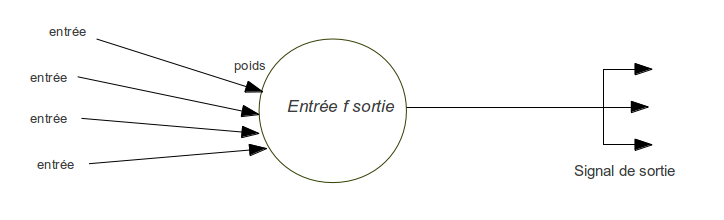
Le neurone intègre des entrées (stimuli) dont la force est plus ou moins importante. Le neurone effectue une opération avec des entrées en vue de générer une sortie. Cette sortie est ensuite transférer à son réseau (i.e. les neurones avec lesquels celui-ci est connecté).

La loi de Hebb

Une autre notion importante à connaître est la théorie Hebbienne de 1949 qui est notamment à la base du concept de la plasticité neuronale. L’apprentissage et la mémoire implique des évolutions au niveau des neurones et synapses notamment une densification synaptique des aires cérébrales concernées par l’apprentissage. Cela est important pour comprendre ensuite comment notre réseau de neurones artificiels apprend ce pour quoi il a été développé.

De manière plus précise, la loi de Hebb exprime la loi de contiguité neuronale : « neurons that fire together, wire together » … Deux zones corticales sont stimulées simultanément à plusieurs reprises, après un certain nombre d’itérations, il suffit d’appliquer l’un des stimuli, ou signaux d’entrées, pour que les zones corticales associées soient automatiquement excitées (passage de 0 à 1).

Cette loi est importante lorsque l’on considère non plus le neurone au niveau individuel mais le neurone dans son écosystème qu’est le réseau.

Du neurone au réseau de neurones : ça se corse !

Un réseau de neurones est une interconnexion totale ou partielle de neurones formels. Il émerge un comportement de ce réseau notamment l’apprentissage (une forme d’intelligence collective).

Il existe plusieurs modèle de réseaux selon l’interconnexion des neurones (le type et le nombre de connexions). Les connexions entre les neurones dans les réseaux sont appelés synapses. Il existe trois grands types de connexions :

  • Le réseau partiellement connecté : les neurones ne sont pas tous connectés entre eux, ils sont connectées avec ceux avoisinants,
  • Le réseau à connexion complète : tous les neurones sont interconnectés,
  • Le réseau à couches : Les neurones sont répartis en couches. Tous les neurones d’une couche sont connectés aux neurones de la couche précédente.

L’information et son transport dans un réseau de neurones réside dans la configuration de celui-ci comme le nombre de neurones, de couches, le nombre de liens avec eux. Le poids synaptique est aussi un facteur important qui représente la force des connexions entre les neurones (comme dans notre cerveau). L’information est transportée avec plus ou moins de force et a une action inhibitrice ou excitatrice. La fonction d’activation joue également un rôle qui détermine la réaction du neurone en fonction de l’information reçue.

En fonction des caractéristiques du réseau de neurones, il permet de modéliser deux niveaux d’apprentissage :

  • Modèle d’apprentissage supervisé : La forme à reproduire par le réseau neuronal est présentée aux entrées et ce qu’on voudrait obtenir aux sorties (nous parlons alors de « réseau à apprentissage supervisé » dans ce cas),
  • Modèle d’apprentissage non supervisé : Une entrée est présentée au réseau et celui-ci évolue jusqu’à se rapprocher de la forme (= réseau à apprentissage non supervisé).

Nous verrons dans les prochains articles des exemples d’application de ces principes.

#systèmes d'information / #transformation numérique / #transformation des organisations / #digitalisation des processus / #humanités digitales

211 commentaires sur “Du neurone à l’intelligence artificielle ?

  1. Wow, amazing weblog format! How lengthy have you been blogging for?

    you make running a blog look easy. The overall look of
    your site is excellent, as smartly as the content!

  2. Ping : cialis amazon
  3. Stackshine https://en.stackshine.io simplifies SaaS spend management with full software visibility, renewal tracking, and employee offboarding automation. Reduce costs, eliminate unused tools, and gain control over subscriptions with a smarter, centralized platform.

  4. Volvo в Україні https://spectehnika-volvo.mystrikingly.com/ екскаватори, фронтальні навантажувачі та дорожні машини. Надійність, ефективність і сучасні рішення для будівництва. Продаж, підбір і обслуговування техніки для бізнесу.

  5. Доставка цветов https://kvarz-shop.ru авторские букеты и редкие композиции с быстрой доставкой. Премиальные цветы, индивидуальный подход и стильное оформление. Закажите уникальный букет для особого случая с гарантией свежести.

  6. Нужны заклепки? заклепки вытяжные алюминиевые 4.0 прочный крепеж для соединения деталей. Алюминиевые, стальные и нержавеющие варианты. Надежность, долговечность и удобство монтажа для различных задач и конструкций.

  7. Лучшее путешествие джиппинг ялта горы, каньоны и побережье. Увлекательные маршруты, опытные гиды и яркие впечатления от путешествий по Крыму.

  8. Хочешь оригинальную подушку? подушка дакимакура 150х50 комфорт и уют для сна. Длинная форма, мягкий наполнитель и стильные принты. Отлично подходит для отдыха и расслабления.

  9. Нужен пластический хирург? https://plasticheskaya-hirurgiya-klinika.ru современные операции и эстетические процедуры. Опытные хирурги, безопасные методики и индивидуальный подход. Консультации, диагностика и качественный результат.

  10. Нужна мебель? премиум мебель эксклюзивные изделия из натурального дерева. Индивидуальный дизайн, качественные материалы и точное изготовление. Решения для дома и бизнеса.

  11. Нужна премиум мебель? https://premialnaya-mebel.ru изготовление на заказ. Натуральные материалы, эксклюзивный дизайн и долговечность. Решения для дома и бизнеса с высоким уровнем качества.

  12. Современный SaaS маркетинг требует данных о действующих ценах и конкурентных позициях на целевых площадках, что делает изучение реального опыта кампаний необходимым элементом планирования. https://npprteam.shop/articles/linkedin/reklama-saas-linkedin-2026-lid-formy-targeting-gajd/ собирает актуальные бенчмарки, примеры таргетирования по должностям и отраслям, а также примеры структуры объявлений, которые показывают наилучшие результаты. Вместе с тем материал содержит рекомендации по выбору формата кампании — спонсируемый контент, текстовые объявления или видео — в зависимости от целей и бюджета. Такой комплексный подход гарантирует, что команда имеет четкие ориентиры для запуска и оптимизации кампаний, минимизируя затраты на обучение и ошибки в процессе масштабирования.

  13. Master the landscape of enterprise antidetect solutions for ad agencies 2026 and gain competitive advantage in a year when platform detection algorithms have reached new sophistication levels. Agencies managing client accounts across multiple verticals—from e-commerce to finance—must balance client isolation, regulatory compliance, and operational efficiency within a single toolset. The 2026 iteration of leading antidetect platforms introduces team permission models, real-time activity logging for audit trails, and API integrations that connect with your existing MarTech stack. Agency operators will find detailed breakdowns of per-seat pricing, feature comparison matrices, and deployment models that range from cloud-hosted to on-premise infrastructure. Implementing the right solution now positions your agency to handle enterprise clients who demand both performance and compliance visibility.

  14. Navigating the distinct mechanics of Snapchat’s content ecosystem requires clarity on where your creative efforts yield maximum return. https://npprteam.shop/en/articles/snapchat/stories-vs-spotlight-what-where-and-how-to-post-for-growth-on-snapchat/, then walks through production standards, posting timing, and optimization tactics for each format. Media buyers and brand managers often waste resources by treating these channels identically, missing opportunities to leverage Spotlight’s discovery potential while simultaneously neglecting Stories’ retention power. The resource addresses common posting mistakes, hooks that capture attention across both formats, and how to repurpose existing content without sacrificing authenticity. Teams implementing both strategies simultaneously report twenty to forty percent improvements in monthly active user engagement and follower growth rates.

  15. When analyzing digital storefront systems focused on structure and ease of use, a strong example is Trail Gilded Shopping District which features a clean layout and ensures everything feels easy to browse through today, supporting smooth navigation and organized content presentation.

  16. In evaluations of digital storefront platforms focused on structure and performance, a strong example is Harbor Stone Market Hub where nice layout with clear sections and straightforward navigation flow, helping users explore products efficiently through clean and organized sections.

  17. Across different UX evaluations of online retail systems, a strong example is Grove Opal Shopping Hall which maintains simple interface and content feels neatly arranged throughout the pages, supporting a seamless browsing experience with clearly organized sections.

  18. In studies of digital commerce interfaces focused on clarity, a strong example is Brook Lemon Trade Corner which ensures easy to navigate and everything is clearly presented without clutter, offering users a smooth and logically arranged browsing experience across sections.

  19. While evaluating different ecommerce prototypes for interface usability and content presentation quality, I navigated a browsing dashboard where Canyon Lemon Trade Corner appeared in a side panel section, and the experience felt easy to understand while exploring categories – the layout was clean and interaction felt responsive throughout.

  20. A strong retail guild system often emphasizes clarity in design so users can quickly scan information and locate relevant items without needing to search extensively Raven Guild Product Access Hub improving browsing speed – The interface feels practical and user focused, ensuring that navigation remains straightforward and easy to manage

  21. During research into various online trading post style websites for usability and design structure I discovered willow trading hub showcase while comparing layouts and navigation systems across similar platforms – Everything felt logically arranged and the browsing experience gave a sense of clarity and ease throughout the entire visit today.

  22. When exploring online retail systems, I observed that simplified interface design significantly improves how quickly users can locate desired product categories and informational pages within a platform Raven Guild Catalog Access Point supporting efficient browsing behavior – The structure feels intuitive, with a natural flow that prevents users from feeling overwhelmed by too many scattered elements

  23. In comparisons of digital retail systems emphasizing UX clarity, a standout example is Glade Night Unified House which delivers everything feels straightforward and browsing is comfortable and stable, ensuring a seamless and well structured browsing experience across the entire site.

  24. During my recent review of different creative vendor websites, I found one that impressed me with its responsiveness, especially when I interacted with Seaside Vendor Portal – the browsing flow felt natural, and each page loaded quickly without unnecessary interruptions or delays.

  25. While browsing through several online pages earlier without expecting much, I paused midway when I encountered a coastal retail hub and I genuinely liked how everything was arranged, making the exploring experience feel much more enjoyable and easy to follow overall.

  26. While analyzing multiple digital marketplace interfaces for usability testing and structure I navigated a catalog module containing a href= »//opalgladeboutiquehall.shop/](https://opalgladeboutiquehall.shop/) » />Glade Opal Hall Boutique Space inside a structured browsing panel, – I like the clean layout, everything is easy to locate and view helping users move through content without confusion or unnecessary complexity

  27. During my search for more detailed explanations, I came across something that seemed slightly different from the rest this link here and it gave me the impression that it could contain useful information worth reviewing

  28. During a general exploration of community outreach initiatives, I came across something placed within the content local hope project and it is a great initiative supporting community causes and strengthening positive local impact overall

  29. As I continued going through various personal branding websites, I encountered something within the text see more here and it looks pretty interesting, making it worth exploring further based on how it is structured

  30. During an in-depth UX evaluation of ecommerce prototypes for navigation efficiency and layout clarity I examined a catalog page featuring a href= »//dawnbrookgoodsatelier.shop/](https://dawnbrookgoodsatelier.shop/) » />Dawn Atelier Brook Goods Exchange inside a product listing module, – the structure makes sense and pages load smoothly which keeps browsing intuitive and free from unnecessary friction or delay

  31. While analyzing several online retail interface prototypes for usability and navigation efficiency I encountered a browsing module displaying Opal Hall Boutique Network within a featured product area – the structure felt consistent and well arranged allowing smooth transitions between sections and making the overall experience quite enjoyable and easy to follow.

  32. After spending some time reviewing different materials, I noticed a reference tucked into the content check this out now and while I cannot say exactly what it leads to, it definitely seems to have a distinctive feel that sets it apart from typical sources

  33. During a general exploration of casual and lifestyle websites, I came across something placed within the content take this link and it looks interesting overall, presenting a fun casual destination site with a relaxed vibe

  34. During a general exploration of civic engagement websites and forums, I came across something placed within the content take this link and it discusses an important topic in a thoughtful and engaging way that feels meaningful overall

  35. During a UX comparison of ecommerce systems for navigation clarity and flow I examined a product listing page featuring a href= »//iciclegrovemerchantmart.shop/](https://iciclegrovemerchantmart.shop/) » />Icicle Mart Grove Merchant Exchange within a structured grid system, – Everything feels simple and straightforward without any distractions ensuring smooth transitions between sections and an easy to understand browsing experience overall

  36. In the middle of browsing through dessert-themed branding and visual identity sites, I came across something that stood out see this sweet page and it has unique branding overall, with everything looking visually appealing and nicely presented

  37. During a comparative UX analysis of online retail interfaces for structure and usability I navigated a catalog page featuring a href= »//emberforesttradingpost.shop/](https://emberforesttradingpost.shop/) » />Ember Trading Post Forest Network inside a sidebar panel, – everything felt smooth and easy to browse which made moving between sections simple and efficient without unnecessary friction

  38. In evaluations of online retail platforms focused on organization and UX design, a strong example is Upland Orchard Trade Hub where well structured pages and browsing feels natural and efficient, supporting a clear and easy user journey across all pages.

  39. During a structured UX comparison of several ecommerce platforms focused on interface behavior and navigation efficiency I examined a listing page where Valley Commerce Upland Store appeared inside a grid-based product display section, – everything loaded quickly and the fast performance helped reduce waiting time while browsing different categories seamlessly.

  40. While reviewing ecommerce prototypes for usability testing and interface structure I navigated a product listing containing a href= »//jewelbrooktradecollective.shop/](https://jewelbrooktradecollective.shop/) » />Collective Jewel Trade Brook Hub inside a structured browsing panel, – Everything is neatly arranged and feels comfortable to explore ensuring intuitive navigation with a clean layout and minimal distraction

  41. While reviewing online commerce systems designed for simplicity and usability, a standout example is Lakefront Frost Commerce Vault which ensures clean interface and everything is easy to navigate without effort, offering a distraction-free browsing experience with smooth navigation across all sections.

  42. While comparing several digital storefront experiments focused on usability and speed optimization, I spent time analyzing page hierarchy and discovered an embedded section referencing Green Forest Commerce Interface design which appeared well balanced – the interface felt structured, and content sections were easy to scan and interact with.

  43. During my exploration of creative portfolio platforms and personal branding pages, I came across something within the text view portfolio page and it has a clean professional design that feels simple, elegant, and visually strong overall

  44. While browsing through different restaurant reviews and local recommendations earlier today, I came across something placed naturally within the content check this restaurant and it really looks like a great place overall, definitely something that caught my attention and made me want to learn more about it

Laisser un commentaire

Votre adresse e-mail ne sera pas publiée. Les champs obligatoires sont indiqués avec *